In this lesson i have read through my feedback sheet and worked on what i need to improve, ive not yet corrected any errors in my work but have planned out what it is that needs correcting, and what stuff i have to do to make it better and achieve a higher grade.
Monday 27 February 2012
Tuesday 21 February 2012


Friday 3 February 2012
Colour Pallet

content's page inspiration


front cover idea

Im chosing to a front cover page like this because i like the simplicity, and the colour scheme that it follows. i wouldnt use these colours on my magazine, but i like the way everything is set out, and the fonts used. so for my mag id use something like this.
photo experiments

This is the type of image that i will be going for on the cover or the contents page of my music magazine, ive chosen to do a mid shot image because its simple, and effective. I'm not keen on the colour of the background, as the colour of the clothing clashes and i think we could find a better backdrop to take the photo on.

Here's another mid shor, i tried to get the head of the model facing the camera, but him looking slighty off centre
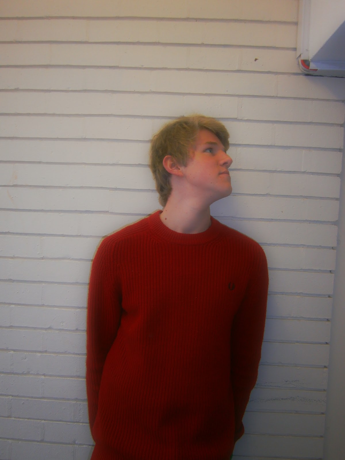
We then moved to a possible different backdrop, i chose a white painted brick wall, which i thought went well with the colours of clothing the model is wearing as its a contrasting colour and makes it stand out. i think ill go for a brick wall backdrop in my magazine.

This is an shot taking against a brick wall outside, i chose to do this because i liked the colour, and the light in this area was good. i got the model to look to the side as it gave of an expression and isnt just a regular image.

This image is a high angle shot, i went for this shot as i had done alot of mid shots and simply wanted to experiment something else. i dont really like the shot, but i think the angle of the image in a possibility.

in this image i wanted the model to look off centre but have his body facing the camera, this particular shot is used in a lot of magazines, and i thing it looks decent.

This is my favourite shot, and probably the type of shot i shall use for my magaizine.

Although i didn't take this phot, i like the natural look of it and the colour greyscale, i like the old tatty background displayed. in this photo i went for a completely natural look, with a straight look into the camera. i dont really like the photo, but i like the fact it looks like its been edited by the background colour and everything.

i dont like this photo at all as it looks like im about to cry, but i think i could use this type of image, close up with head facing off centre. the effect used on the camera to blur and darken the ages worked well to. i like everything about this photo, but my face. probably to do with it being -3 degreese and george wanting a t-shirt picture.

I didnt take this photo, but i told the photographer how i wanted it and the effect i was trying to put across. i like the simplicity and the chilled feeling about the image, this could work as a group photo, possibly add a couple more people the the shot in the future.

I like how this image is put together and the simplicity of it. i think ill use an image like this for my magazine, as its effective, simple, and looks siiiiick.
Wednesday 1 February 2012
Artist Profile
My artist Liam Jacobs is a 19 year old former student studying economics at Kings College in London. he recently dropped out of UNI to pursue his dream of becoming a music artist after his YouTube channel was picked up by cult indie label 'Columbia Records'. He is now part of the up and coming new to the scene indie band 'Radar'. The group consistes of Liam and three of his fellow UNI pals, Tom, James and Ash. The four all go to Kings Cross College, study different subjects but all have the same dream of creating and performing their own music. so when they were offered a recording session by Columbia Records, they jumped at the chance.
Subscribe to:
Posts (Atom)